Posts

Showing posts from June, 2014

CSS Tutorial - Table of contents

How does CSS work? Method 1: In-line (the attribute style) One way to apply CSS to HTML is by using the HTML attribute style. Building on the above example with the red background color, it can be applied like this:     <html>       <head>         <title>css zilla</title>       </head>       <body style="background-color: #FF0000;">         <p>CSS Zilla the ultimate css blog</p>       </body>     </html>     Method 2: Internal (the tag style) Another way is to include the CSS codes using the HTML tag <style>. For example like this:     <html>       <head>         <title>css zilla</title>         <style type="text/css">           body {background-color: #FF0000;}         </style>       </head>       <body>         <p>CSS Zilla the ultimate css blog</p>       </body>     </html>     Method 3: External (link to a style sheet) An

Web Designing Interview Questions And Answers

Image
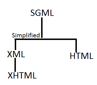
Question: What is the relationship between SGML,HTML , XML and HTML ? Answers:  SGML stand for (standard generalizd markup language) is a standard which tells us how to specify document markup. Its only a meta language which describes how a document should be markup. HTML stands for hyper text markup language. HTML is described using SGML. By SGML they created DTD which the HTML refres. So we find "DOCTYPE" attribute at the top of HTML page whcih defines DTD is used for parsing purpose. <!DOCTYPE html PUBLIC "-//W3C//DTD HTML 4.01//EN" "http://www.w3.org/TR/html4/strict.dtd">  Simply in short SGML is parent for every one. Older HTML utilize SGML and HTML 4.0 uses XHTML which is derived from XML. QUESTION: What is HTML5? Answers: HTML 5 is new standard for HTML whose main target is to deliver everything without using third party plugins example flash, silver light etc. It provide us facility for attach Animation, vide

how we user bxslider in our web template

Hello Guys, You have some doubt in your mind regarding responsive slider which adapt itself with varying responsive sizes. Why should I use this slider?   Fully responsive slider - will adapt to any device; Horizontal, vertical, and fade modes; Slides can contain images, video, or HTML content ... 1. Fully responsive - will adapt to any device 2. Horizontal, vertical, and fade modes 3. Slides can contain images, video, or HTML content 4. Advanced touch / swipe support built-in 5. Uses CSS transitions for slide animation (native hardware acceleration!) 6. Full callback API and public methods 7. Small file size, fully themed, simple to implement 8. Browser support: Firefox, Chrome, Safari, iOS, Android, IE7+ 9.Tons of configuration options How we install bx-slider? Download bxslider:  http://bxslider.com/ Step1: Required files. <!-- jQuery library (served from Google) --> <script src="//ajax.googleapis.com/ajax/libs/jquery/1.8.2/jquery.min.js&quo

CSS Writing Standard

/* Theme Name: CSS ZILLA Theme Theme URI: http://csszilla.blogspot.com/ Author: the WordPress team Author URI: http://csszilla.blogspot.com/ Description: Css Zilla, Easy Css Tricks, Css3 Basics, Css Help - CSSZilla */ /*==========================================  Reset Css Start Here  ==========================================*/ html, body, div, span, object, iframe, h1, h2, h3, h4, h5, h6, p, blockquote, pre, abbr, address, cite, code, del, dfn, em, img, ins, kbd, q, samp, small, strong, sub, sup, var, b, i, dl, dt, dd, ol, ul, li, fieldset, form, label, legend, table, caption, tbody, tfoot, thead, tr, th, td, article, aside, canvas, details, figcaption, figure, footer, header, hgroup, menu, nav, section, summary, time, mark, audio, video { margin: 0; padding: 0; border: 0; outline: 0; font-size: 100%; vertical-align: baseline; background: transparent; } body { line-height: 1; } article, aside, details, figcaption, figure, footer, header, hgroup, menu,

How we use bootstrap css, simple basics of bootstrap css,

Hello Guys, Today we understandd the basics of bootstrap css. For download the bootstarp css refer this link. http://getbootstrap.com/. Bootstrap is responsive css framework for develop responsive websites and mobile first projects on web. In bootstrap responsive framework their is four major classes which is added on any div or section for control its width in responsive screen. For eaxmple col-lg-12 up to col-lg-1 is classes used for control width on large screen monitor. same as col-md-12 upto col-md-1 is classes used for control width in medium screen monitor same as col-sm-12 upto col-sm-1 is classes used for control width in laptop screen and last one is col-xs-12 upto col-xs-1 is used for control width in mobile screen. working area of these classes is differ from each other. maintained by container width. Question: How we use bootstrap 3.0 in our project. Answer: first download bootstrap 3.0 by clicking above link. Now create a simple html file on any html editor